 DS Development News
- Version 4 of Bells and Whistles for Outlook
- Weight Diet for Outlook
- Using Outlook Connectors
- Email read and delivery confirmations
- Auto Follow Up v1.0
- Easy Mail Merge v1.1.95
- Send Email Limit for SMTP Mail Servers - The Basics
- Best practices for effective email marketing
- How to Manage or Remove Outlook Add-ins
- Auto Reply Manager - Update 2.0.80
Tags: email signatures · marketing emails · marketing signatures · Outlook signatures
Email Signatures and signing things, in general
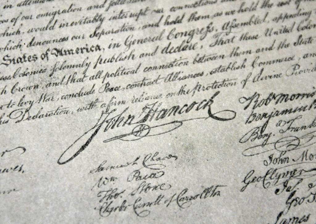
Although signatures, in one form or another, have been used from the dawn of civilization (with our ancestors leaving their handprints on walls and caves) only recently have they begun radically evolving. Through the ages the styles, letters, colors and so on changed continuously, but only for a couple of decades, with the invention of emails and the modern communications network, have email signatures started changing the basic nature of signing as well. For thousands of years, a signature was used by monarchs to display their power, by officials to legalize documents, by criminals to boast their wrongdoings or by painters to authenticate their works. Through countless transformations, from wax seals to tags sprayed on walls by night-oriented artists, a signature always assumed a role of identifying an individual quickly, especially if the person is communicating or approving something (just remember the John Hancock on the Declaration of Independence – link, or the British street artist Banksy – link). This is not entirely true of email signatures, though…
Lately, one can see that things started taking a more commercial turn, as most things do nowadays. This is the evolution I am talking about, the one where you see that Mr. John Smith is working for a Fortune 500 Company (from his email signature, none the less) and the company he represents weighs heavier than the actual person in your mind. Of course, this is not always true, especially for people you already know, but if you receive a newsletter or commercial message, then the company sending it will seem more important than the individual.
So, let’s explain how email signatures’ look & feel can drastically change the recipient’s view and even future actions. In order to do this, we will give a couple of email signature examples, since it’s much easier to explain the DOs & DON’Ts this way.
For some reason or other, our John Smith suddenly decided to resign from his job at The Company and, with his savings, start the life-long dream of being a… fish trainer (no offense meant to any fish trainers out there). So, he does everything that needs doing in order to launch his business, and chooses to inform all his friends, family and old partners of the newly-opened John Smith Institute for Fish.
I must reiterate that our protagonist is a fictional one and any resemblance to an existing person or his email signatures is purely out of coincidence.
Email signature Example no.1 – IMAGES in email signatures
After composing a short message detailing the workings of his business, John closes it with what he thinks is a nicely-done, colorful email signature that will accentuate his commitment and future plans.
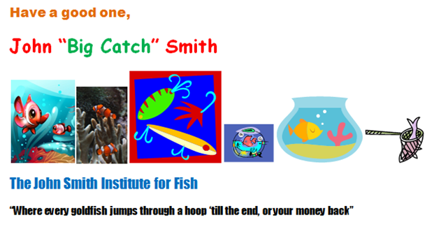
The above example, although extreme, is very likely to appeal to some. It is incorrect on so many levels that I will just point out the glaring ones now and concentrate on the details later. John probably wants to emphasize that he is a fun person, but unfortunately, his email signature gives the impression of a spam message. First of all, in his emails and signatures he should never insert pictures that relate to his business only by extrapolation. If you’ve noticed, the third and last images in his email signature are actually of fishing, and they may cause a negative first impression on some fish enthusiasts. Also, his images are of different sizes, orientations and types (meaning one is a 3D render, one is an actual photograph, others are drawings and doodles – both portrait and landscape) which, once again, give the feeling of “thrown together” rather than “carefully planned”. Note that some people actually take offense in overly large email signatures that take up bandwidth to download and time to display (since the pictures add to the size of the incoming message – bad “netiquette”).
One has to remember that the signature in emails is a sort-of mirror to the person who inserted it or his business: John should think and compose one that correctly describes his passion and professionalism, no matter the subject of his work.
Email signature Example no.2 – Proper fonts for signatures and emails
Having realized that so many images don’t bode well, John gives it another try:
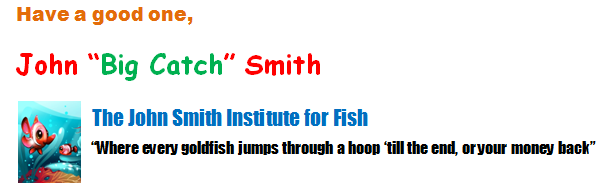
So, he decided on one image of a reasonable size, but now he still has to make some modifications until his email signature will be well-received by all future customers.
An unwritten rule is that one must never use more than one type of font in any message; preferably, the email signature should be written with the same font, size (and even color) as the actual body of the email, since it will give the impression of continuity and professionalism. In addition, the type of font used actually does matter; John should use a font that’s easy to read, both at small sizes and at large ones. Since some of his recipients may have their messages (and, consequently, the email signatures) displayed at a default view of 80% and not 100%, the lines detailing the name of his business and his motto will not be readable and cause frustration. Another rule, which is actually quite repeated on the Internet, is that you should never use Comic Sans in any of your messages, especially commercial-oriented ones. I would rather not go into the “gory” details, but a Google search of “do not use Comic Sans” will provide you with all the info you need (fun facts: there is actually an 11-year running campaign to ban this typeface – here, and even BBC wrote an entire article based on it – here).
As a suggestion, some of the best fonts for messages and email signatures are already included in Microsoft Office, and just to name a few:

Always try to avoid the more “exotic” typefaces, since there is always the possibility that a font on your system may not be present on one of your recipient’s computer. Thus, your email and signature will be reset to the default font and you may lose your desired formatting and make the email look “messy”.
Also, try not to use “hand-written” fonts for email signatures, even if they may look interesting, since everybody knows it’s just another typeface (in this case, LainieDaySH), and the fact that you can select it letter by letter with the mouse really ruins the look; better just use the same font as in the message.

An important thing to remember is that some email clients have a maximum viewing width of 65 characters, and John’s motto is over that limit by more than 10 (it is actually 78 characters long). Because of this, it may “break” onto the next line, again – giving it a messy look. In these same lines, he should use spaces instead of tabs, since tabs and text are displayed differently on different machines [source].
So, John should try to find a clearer and more neutral font now, use the same size and/or color and do a bit of “tweaking” on his motto for his next email signature.
Email signature Example no.3 – Content of an email signature
Having picked Calibri as his font of choice and a different image for his business and email signature (since the last one was kind of complicated and hard to view if scaled down), our protagonist is left with the following:
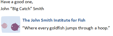
As I stated in one of my previous articles (which was about anti-spam acts), all commercial messages have to contain a specific set of information, or else he may very well be called in-court. John has to include his physical address and an unsubscribe link, a reply-to email address as well as label the message as an ad and include his name and position. He already does one of these, he’ll just have to provide the others in a reasonable format in his email signature.
Additionally, his tone is much too friendly and relaxed. Since he is a fish trainer now, he doesn’t actually have to resort to lines such as “Respectfully yours,”, but “Best Regards” sounds better, doesn’t it? Also, including his nickname doesn’t present the receiver with any useable or interesting information, and just like with the fishing pictures, having “Big Catch” as a nickname in his email signature will turn some away from his business.
Another rule is that email signatures should not be longer than 6 lines, 8 at the most and John will have to take it into account when adding all the extra data.
As a suggestion, you can also add in your signatures the email address, even if it is clearly stated in the ”From” field – this will help people quickly add you to their contacts, without the need of scrolling to the top of the message.
Email signature Example no.4 – Finished, at last
So, this is the end of John’s email signature’s road and although a bumpy one, it really looks the part now:
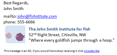
Some may say that it can be tweaked even further, but he rather likes it this way, and you just have to scroll up a couple of lines to see how much better his email signature is now (compared to the first, spam-like one). Additionally, it will look ok when viewed as plain-text, since its structure is what gives it strength, and not the image, font or colors. For his fish training institute to have a blooming start, he should use his personalized email signature on all of his messages, forum posts and newsgroups, since it will definitely be seen and remembered, and at the least, bring customer attention to his business. With his new-found knowledge, he also composes a couple of different signatures for emails, since he doesn’t want to answer the messages from his family and friends this way; also he still communicates with his colleagues back at The Company and he doesn’t want to be made fun of by a couple of college buddies he sends e-cards now and then. So, he has about 4-5 email signatures that he continually switches during his day-to-day tasks (don’t us all?). Since Outlook can only insert one for each account defined, he starts off his day by opening the MS Word document in which he holds all of them in, and copy/pastes the appropriate ones in each message from then on. What will happen if his business takes off, and he can afford to open that aquarium he always wanted? If I may, I have a suggestion for John: one of our products can handle all of his repetitive tasks easily: Bells and Whistles for Outlook, our award-winning productivity add-in and email tool. With it, he can insert specific greetings and email signatures, define complex send options and many, many others (it’s also getting an update soon!).
So, in the end, try to compose both your emails and signatures in a way so that they are easy to read and understand, and take a little more time in placing the elements “just right”. After all, it’s free publicity and exposure, where image always counts…
If you have ever sent out an email newsletter, I’m sure that with each passing campaign you encountered people who opted out of your email list. Have you ever asked yourself why? Read more: Why do people unsubscribe to emails? | 1 Comment
The subject line in an email, almost as much as the from line, is one of the most important deal-breakers for your readers. That’s why this week we looked at how different email clients (on all platforms we could get our hands on) dealt with them… So, continue reading and see for yourself how many characters your subject line should have! Read more: The maximum displayed length of the email subject line | 1 Comment
In last week’s article, we hoped to convince you that the from line is at least as important as the subject line in all your email communications. Now, to help you out, we tested different platforms and came up with the following “cheat-sheet”, detailing the maximum displayed length of the from line on different browsers, phones and desktop applications! Read more: The maximum displayed length of the email from line | 2 Comments
Blog on Email Productivity & Outlook Add-ins · March 24, 2011 at 3:08 pm
[…] The DOs & DON’Ts of Email signatures […]
Use an email signature creator for that great look you’ve been looking for! « Email & Outlook · February 15, 2012 at 5:27 pm
[…] The DOs & DON’Ts of Email signatures […]