 DS Development News
- Version 4 of Bells and Whistles for Outlook
- Weight Diet for Outlook
- Using Outlook Connectors
- Email read and delivery confirmations
- Auto Follow Up v1.0
- Easy Mail Merge v1.1.95
- Send Email Limit for SMTP Mail Servers - The Basics
- Best practices for effective email marketing
- How to Manage or Remove Outlook Add-ins
- Auto Reply Manager - Update 2.0.80
12
The best email fonts are the ones already included in Outlook!
2 Comments · Posted by Bogdan in Email & Outlook
Tags: best email fonts · best typeface for emails · email fonts history · fonts trivia · free fonts for emails
If you’ve ever wondered what the best font for emails is, or how your recipients will see what you sent them, then look no further – here’s a short history of the best fonts to use in your emails, along with a few explanations and trivia facts.

Just as a general guideline, you should know that there are two main types of fonts: SERIF and SANS SERIF. Even though this may sound technical, it’s quite easy to explain: a SERIF font has all those little “legs” and “tails”, while the SANS SERIF (literally “without serifs”) doesn’t.

Email Fonts Trivia #1. When composing your emails, newsletters and so on, you should take into account that a serif font usually creates the impression of reading a book and offers a “classy” feel, while a sans serif font gives a cleaner, more modern look. In the print era, where you were reading on paper, serif fonts were used in the body of the text because it’s thought that they help guide the eye to the next character, hence making reading easier. Now, since most of us are slowly going blind 🙂 from emails and computer screens this has reversed: you use serifs in the headlines [source] and sans serifs in the actual text because they are better recognized.
Of course, you can use either type of fonts for your emails as long as the result is readable, so we’ll delve into that with the following examples.
Email Fonts Examples
The best email fonts that you can use must be, out of necessity, the ones that are common on all platforms and devices. It doesn’t matter if you align your text and take great care in the (typographic) layout of your email if the other person doesn’t have that font installed – all your hard work will go to waste, especially since you can’t embed a font in your emails like you’d do with a Word document or PowerPoint presentation. So, even if you may like how Futura looks as a headline, your best choice is one of the default installed fonts. Luckily, there are a few that can do a great job!
If you’re working on a Windows computer, then you must surely know about these two classics: Arial and Times New Roman.
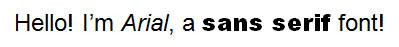
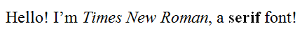
Both of them are great and easily readable! Generally speaking, you can’t go wrong if you send out a periodic email in Arial detailing your prices or a long text in Times New Roman – the fact that they’re good and get the job done can be attested by their notoriety.
Email Fonts Trivia #2. Times New Roman was commissioned in 1931 by The Times and is now the most widely-printed font in the world. [source]
Email Fonts Trivia #3. Arial resembles one of the best-known and used fonts of all times, Helvetica (there’s even a movie about this typeface).
Font design has changed drastically in the last decades with the appearance of the computer screen… In order to tackle this ever-increasing medium, Microsoft hired Matthew Carter (one of the most influential type designers of the last century) to develop the best font for the monitor. He, alongside Thomas Rickner (Apple’s ex-Lead Typographer), came up with not one, but two typefaces (fonts) that not only look the part, but are also regarded in high esteem by the fussy design community (no small feat!).
These are some of the best choices for email fonts that you can find, and are distributed on both the Windows and the MacOS platforms – so, your emails will look just as great on all your recipients’ screens. Even better, they’re free so you can use them in your commercial emails.
Email Fonts Trivia #4. If you’ve ever wondered what font you are seeing when you read a Wikipedia article, it’s Arial.
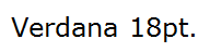
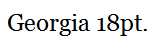
Both Verdana and Georgia (its serif counterpart) were painstakingly designed to adhere to the modern screen requirements. Matthew Carter and Thomas Rickner took turns trying to read a computer screen at different distances and font sizes, they created each “glyph”(symbol) so that it aligns perfectly with the pixel pattern, they delved into al the technicalities and intricacies that the display holds over paper and some months later finally presented their findings. What we users received is a pair of fonts that basically wrote the standards for developing and displaying text on screen and are great for all our emails and communications.
Email Fonts Trivia #5. Georgia gets its name from a tabloid headline, titled “Alien heads found in Georgia.” [source]
Because of the scope these fonts have to encompass, there are a couple of minor bugs. For example, Verdana isn’t suited for Greek or Cyrillic because of its combining characters bug or for writing in German because of its quotation marks bug.
Email Fonts Trivia #6. Verdana is currently used in both IKEA’s websites and in their catalogues. IKEA decided to change the catalogue font in 2009 from Futura to this typeface in order to create a <more homogenous feel across the mediums> (designers were not pleased).
Runner-up email fonts – they can still pack a punch!
The four email fonts described above are your best choices, having a long history and a “pedigree birth”, because they are available on all OS-s and can be used in almost any email circumstance. My best advice would be to try them all out, and you’ll soon choose your “go-to”, best email font.
Even so, there are countless others, and of which deserve a special mention. From the plethora of choices here are a few that can qualify for “best email font”:
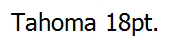
Pros: Tahoma has a more complete Unicode character set than Verdana or Georgia, so it’s a better email font if you need to write in more exotic languages. You may recognize it from the default appearance settings, from Windows 98 to XP.
Cons: it’s not available on all platforms, so not the best choice as a default email font.
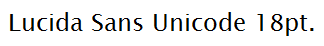
Pros: includes most characters from Unicode 2.0, exotic language support, includes the letters used in the International Phonetic Alphabet (ideal for upside-down text).
Cons: it’s not available on all platforms, so not the best choice as a default email font.
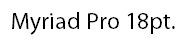
Pros: very good heritage. Some of its versions are currently being used by Apple, Cambridge University, University of Virginia, U. of Chicago, U. of Nevada – Reno, U. of Ottawa, Wells Fargo, Wal-Mart, Linkedin, and Woolworths Australia. It’s available on both the Windows platform and the Apple OS.
Cons: doesn’t support exotic languages.
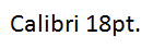
Pros: designed to take advantage of Microsoft’s ClearType technology, it replaces Times New Roman in MS Office 2007 and 2010.
Cons: it’s not available by default on all platforms, but you can install it freely and it is bundled in a couple of free products, both for Windows and Macs.
Now, if you would like to send a font by email to your recipients so they can see your emails better, just go to C:\Windows\Fonts, copy it to another location and send it as a normal file attachment in an email (of course, take into account that your chosen email font may be subject to copyright, non-distribution laws and so on).
In the end, you’ll have to make a choice between looks, usability and accessibility. If you want to use a specific email font for only some recipients, you would normally have to change to it each time you wrote them. Even more, some businesses require you to use a specific font in your internal emails, and another one for your communications with clients. Here’s where Bells&Whistles for Outlook comes in, our feature-packed add-in for Outlook that says “so long!” to repetitive email tasks. With Bells&Whistles you can easily define specific formatting and email fonts used with each of your recipients, so you won’t have to manually select and change every time. In addition, our award-winning add-in comes with more than 40 features that will surely energize your day and speed-up your workflow.
You can buy a lifetime license for Bells&Whistles for only $29.95 here, or just try it out for a month free of charge by downloading it from here.
If you have ever sent out an email newsletter, I’m sure that with each passing campaign you encountered people who opted out of your email list. Have you ever asked yourself why? Read more: Why do people unsubscribe to emails? | 1 Comment
The subject line in an email, almost as much as the from line, is one of the most important deal-breakers for your readers. That’s why this week we looked at how different email clients (on all platforms we could get our hands on) dealt with them… So, continue reading and see for yourself how many characters your subject line should have! Read more: The maximum displayed length of the email subject line | 1 Comment
In last week’s article, we hoped to convince you that the from line is at least as important as the subject line in all your email communications. Now, to help you out, we tested different platforms and came up with the following “cheat-sheet”, detailing the maximum displayed length of the from line on different browsers, phones and desktop applications! Read more: The maximum displayed length of the email from line | 2 Comments
2 comments
<< How to disable “a program is trying to […]” pop-ups in Outlook
Free email resources (icons, email backgrounds, stock photos) for all your future communications « Email & Outlook · October 14, 2011 at 3:40 pm
[…] The best email fonts are the ones already included in Outlook! […]
Typography: What is the best font family to write a good-looking email? - Quora · May 1, 2013 at 12:16 am
[…] or "sans-serif"? font family, font size, paragraph, line spacing? http://blog.emailaddressmanager…. Sign in to read all of Quora.Sign In with FacebookConnected to FacebookSign In with GoogleConnected […]